
이스픈) MLB 구단의 로고 랭킹 1위 부터 30위 까지.
- 작성일
- 11-01-21 13:10
ESPN 2 는 엔터테인먼트와 그외적인 요소가 많이 담겨있는 컬럼들이 실리는 곳인데,
Jim Caple 이란 사람이 메쟈 구단 30개의 로고의 순위를 매겼습니다.
"로고란 자고로 야구와 엔터테인먼트 요소 둘다 갖추고 있어야 한다.
최근에는 멋진 만화요소를 담고 있는 로고가 메이저에서는 사라지는 추세라서 아쉽다.
다행이 아직 마이너에는 재미있으면서도 멋있는 캐릭터가 살아있는 로고들이 많다."
Ranking the official major league logos (remember, we're talking logos, not cap insignias):

1. Mets
난 메츠 팬이 아니지만 난 이 로고를 예전부터 좋아했다. 파란색 스카인라인의 배경과 뉴욕을 상징하는 하얀색 다리. 색깔의 조화가 훌륭한 로고다.
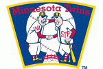
2. Twins
살짝 룰을 어긋나게 현재 로고를 선택하지 않았지만, 이 옛날 로고는 정말 좋아한다. 현재 이 로고는 유니폼에 다는 패치로 쓰이고, 새 구장의 스코어보드에 쓰이고 있다. 비슷하게 생긴 둘이서 미시시피강을 사이로 두고 손을 잡고 있는 이 로고는 미네소타를 잘 나타낸다.

3. Red Sox
두개의 양말은 산타 클로스가 저 양말에 칼 크로포드와 애드 곤을 선물로 넣어줄거 같은 (물론 $200 M 짜리 청구서와 같이) 뭔가 천진난만하면서도 매력적인 로고이다.

4. Dodgers
클래식한 글자체지만 위로 솟구치는 공이 로고를 더 살려준다. 로고를 보면 빈 스컬리의 해설, 쿠팩스와 발렌주엘라의 피칭, LA의 따듯한 기후와 주차장에서 맡을수 있는 차의 매연까지 느껴지는 로고이다.

5. Yankees
세계에서 가장 유명하고, 클래식한 느낌을 주는 이 로고는 보석회사 티파니가 만든 로고로, 오리지날 로고 였던 야구방망이와 엉클 샘의 모자만 달랑있었던 로고에서 좀더 여러 요소를 가미했다. 롸드가 저 모자를 쓰고 타석에 맨날 들어서면 재미있을텐데...

6. Tigers
디트로이트의 D는 야구계의 펜실베니아 주립대 유니폼과 비슷하다 (주: 펜 주립대의 유니폼이 깔끔하게 곤색입니다.). 깔끔하고, 심플하고, 전통이 있는 그런 로고라고 할수 있겠다. 호랑이가 뱃을 들고 서있는 로고도 상당히 좋아한다. 그거 알았니? 그 로고가 나중에 켈로그 콘프로스트의 로고이 토니 더 타이거가 되었다는거...

7. Cardinals
내가 6살때 이 로고는 내 마음을 사로잡았었다. 옛날에는 연고가 있는 팀은 다른 도시의 물건을 살수 없었기에 어렸을때 나는 이 로고를 티셔츠에 그림으로 그려넣어 입고 다녔었었다. 근데 짜증나는건, 그림을 그리고 나서 새가 앉아 있는게 나뭇가지가 아니라 야구 배트 였다는 알았다는 거지...

8. Rockies
이 로고는 내가 좋아하는 마이너리그 스타일로 보라색 산과 야구공을 잘 조화시킨 로고다. 오로지 아쉬운건 튤로가 나와서 "내가 저 산을 홈런으로 넘길지 안넘길지 내기할래"라는 문구다.

9. Angels
큰 A 와 Halo가 잘 어울리는 로고다. 랠리 몽키가 A의 꼭대기의 위에 올라타서 비행기를 부수지 않고 있는게 다행이다. (주: 킹콩의 비유인듯)

10. White Sox
이 로고의 디자인은 참 독특하다. 팬들과 비슷하게 약간 센 느낌의 로고지만, 위엄이 느껴지는 로고다. "그래 여기가 남부 시카고야, 너는 신경쓰지도 않겠지. 하지만 우리는 신경안써 그래도 우리는 지난 세기에 우승 한번 했으니까." 라는 말이 저절로 들리는 듯한 로고같다.

11. Cubs
It works well enough because it is so identifiable and enduring, but I think perhaps it is also too derivative of a bulls-eye. As in, "We're an easy target for every team to beat like a drum."

12. A's
Everything looks better in concentric circles, don't you think?

13. Royals
It's nice to know the Royals preserve some shred of evidence that they were once baseball royalty before trading their kingdom, castle, throne, crown jewels, scepter and perpetual tax-levying rights in exchange for about eight dozen minor league prospects who never amounted to anything.

14. Giants
I like how the large type-face accentuates the Giants' nickname, but I suspect I wouldn't be quite so impressed if I didn't grow up a San Francisco fan.

15. Reds
It's OK, but I miss Mr. Redlegs hustling inside the big C as if he were Joe Morgan scoring from first on a Johnny Bench double or Pete Rose legging out a base on balls.
![]()
16. Nationals
How can you have a team in Washington without incorporating one of the city's three iconic images: the Washington Monument, the Capital Dome or a lobbyist passing out envelopes bulging with cash?

17. Diamondbacks
A good try but ultimately a swing and a miss, not unlike a Mark Reynolds at-bat.

18. Atlanta
Well, it certainly beats the old logo of a Native American warrior screaming so demonstrably it was as if he just received his season-ticket renewal bill.

19. Marlins
I get what they're going for here, and part of me likes it. But whenever I see it, a bigger part of me thinks of Gilligan and the Skipper posing with the life preserver from the S.S. Minnow.

20. Mariners
I'm not exactly sure how to read the "compass rose," and based on Seattle's moves in recent years (seven managerial changes since 2002), I'm not sure the Mariners know, either.

21. Brewers
Which camp were you in? That the old logo of an "M" and "B" forming a mitt was very clever or just a little too clever for its own good? I could never make up my mind. Apparently, the Brewers couldn't either, which is why we have the current logo.

22. Orioles
I'm sorry. This isn't the Audubon Society, this is a baseball team. The old cartoon Oriole was good enough for Brooks Robinson, Boog Powell, Frank Robinson, Jim Palmer and Cal Ripken. It should be good enough for Matt Wieters and Luke Scott.

23. Phillies
I like the individual elements, but it's just a little too crowded inside that ball field outline, don't you think? Kind of like Greg Luzinski squeezing into one of those polyester uniforms after it had been left in the dryer too long.

24. Pirates
As a fan of cartoon logos, I should like this, but I just don't care for the scratchy artistic style of the cartoon. The pirate looks a little too aggressive, though perhaps that's because he is pissed off about 18 consecutive losing seasons.

25. Rays
OK, they got rid of the big, bad "devil." I hope everyone is satisfied. Because they got baseball's most boring logo in its place.

26. Rangers
Note to Nolan Ryan. Congratulations on the minority ownership thing. Way to get the Rangers to the World Series. And keep up the effort to have starters pitch longer into games. But can you please turn your attention to something really important, like getting the team a decent logo?

27. Padres
I'm not sure if this is a logo for a baseball team or a laundry detergent.

28. Blue Jays
Toronto tried to improve its old logo a couple years ago. It failed.

29. Astros
You know that overly quoted "Apollo 13" line that every headline writer has used at least 17 times? Well, when Tom Hanks said, "Houston, we have a problem," I think he is talking about this logo. I know Houston doesn't play in the Astrodome anymore, but the team would be a lot better off with the old logo of the baseballs orbiting the stadium.

30. Cleveland
And sometimes, even cartoons are just wildly inappropriate. People defend Chief Wahoo on the basis of tradition, but what kind of a defense is that? Yes, it's incredibly offensive, but we've been offending people with it for soooooo long we can't stop now. Do you think any responsible team or business would produce this logo today? Of course not. The only way a team could be more tone deaf to society values is if a franchise based in, say, the nation's capital used a racial slur for its team name.
출처: http://sports.espn.go.com/espn/page2/story?page=caple/110119_MLB_logos&sportCat=mlb
 MLB 구단의 로고 랭킹 1위 부터 30위 까지.', 'ESPN 2 는 엔터테인먼트와 그외적인 요소가 많이 담겨있는 컬럼들이 실리는 곳인데, Jim Caple 이란 사람이 메쟈 구단 30개의 로고의 순위를 매겼습니다."…', 'http://a.espncdn.com/i/teamlogos/mlb/med/trans/nym.gif');)